
Dataviz
FANTASTIC talk on DataViz
I did not attend to rstudioconf-2020, but I engaged the #rstudioconf2020 watch many of the talks. One of them I particularly loved was “The glamour of Graphic” by Will Chase. As he sayed in his talk, once you learnt certain things, you cannot stop noticing where those amazing trick are not being used, and I find this to be so true for dataviz!
I start from the premise that any plotting should be done with ggplot2. I find that starting with tidy data is the main benefit of ggplot2.
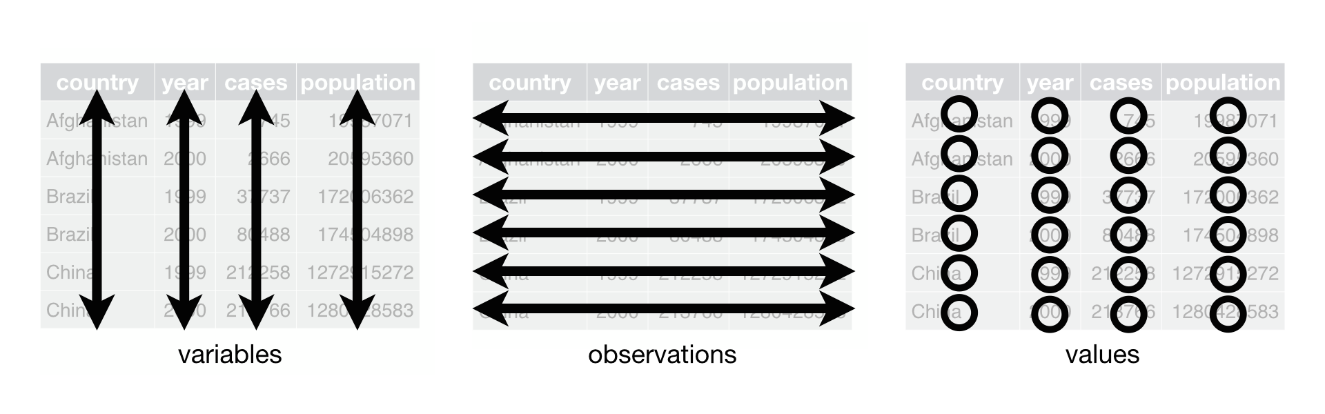
Three rules makes a dataset tidy: variables are in columns, observations are in rows, and values are in cells
In that talk, Will talked how we should build graphics using the three layers of grammar but thing about the three layers of glamour

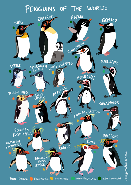
I am going to explore cute palmerpenguins, and interesting alternative to the iris dataset. It has measurements for penguin species, island in Palmer Archipelago, size (flipper length, body mass, bill dimensions), and sex.
Penguins Dataset Overview
Install package
Loading Library
library(tidyverse)
library(dplyr)
library(palmerpenguins)
library(skimr)
library(janitor) # this is to have clean names
One observation is that there are missing values, which are not present in the iris dataset. Let’s count where the missing values are
penguins %>%
  # dplyr::select(everything()) %>%
  summarise_all(funs(sum(is.na(.)))) %>%
  pivot_longer(cols = 1:7, names_to = "columns", values_to = "NA_count") %>%
  mutate_if(is.character, as.factor) %>%
  mutate(columns = fct_reorder(columns, NA_count)) %>%
  ggplot(aes(y = columns, x = NA_count)) +
  geom_col(fill = "darkorange") +
  geom_label(aes(label = NA_count)) +
  #   scale_fill_manual(values = c("darkorange","purple","cyan4")) +
  theme_classic() +
  labs(
    title = "Penguins - NA Count",
    subtitle = "Aesthetic fixes", caption = "Graphic:
     @dermitmaria\nData:Penguins"
  ) +
  theme(
    axis.title.x = element_blank(),
    axis.title.y = element_blank(),
    plot.title.position = "plot",
    plot.caption.position = "plot"
  )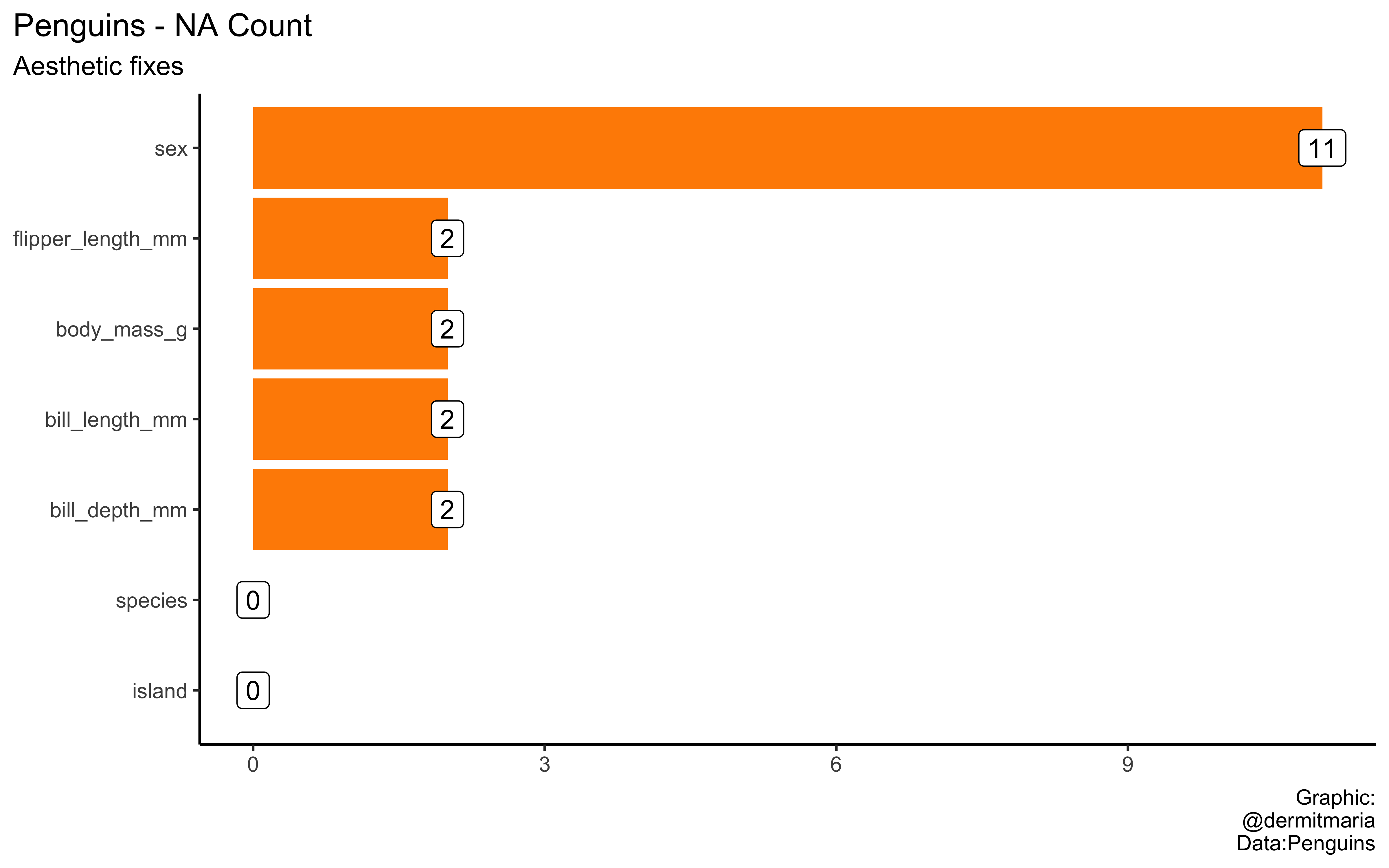
- Things that I learnt on that course and applied on this plot:
- Descending order
- Left-aligned text
- Remove labels
- Things that I learnt on that course but have not applied on this plot:
- The importance of good font.
- Clean names
- Remove white spaces


